◀︎ BLOG
Use These ‘Dummy Numbers’ When Prototyping With Data
If you’re a designer, chances are you’ve heard of Lorem Ipsum—a block of text loosely based on Cicero's De finibus bonorum et malorum that's commonly used as placeholder copy in graphic layouts. While the text is close to coherent if you can read Latin, it appears as legible nonsense to the rest of us. Lorem ipsum looks realistic but doesn’t convey any information to the reader that could otherwise color their interpretation of the mockup. This is great for text-based layouts, but when it comes to placeholder data, we don’t really have an equivalent. What if we had something like Lorem ipsum... but for numbers?
The numbers problem
This idea came from a real project: IDEO data scientist Chris Kucharczyk ran into a problem while prototyping a dashboard for a client. The dashboard was supposed to show sales data for business owners. He was using placeholder data in the mockup, but it just didn’t look right. At IDEO, we often use placeholder data in these mockups before we know what kind of real data we need. It allows us to prototype, then pivot quickly if and when we learn a different kind of data is needed.
By sharing a prototype, Chris was hoping it could help his team talk to the client and better understand what questions business owners would have when coming to the dashboard. More specifically, he and the team were wondering this: How do these business owners use data to help them run their business, and what would they change if they saw certain patterns in the data
The foreign language effect
We’ve learned that people often interrogate numbers more scrupulously than they do other parts of a design and are very sensitive to numbers looking “wrong.” Whether it's restaurant data or health data, a wrong number—even if it's a placeholder—causes the viewer to want to correct that "wrong-ness" rather than respond to the placement, color, or size of the numbers.
In fact, numbers that appear uninformed can derail a conversation even if the point of the conversation is to find out what kinds of numbers are needed. While mockups plainly look unfinished, numbers always look high-fidelity due to the “foreign language” effect.
For example, if you were to pick up a newspaper written in a language you didn't understand, your eyes physically look at that differently. But if that newspaper has charts or graphs, you'll be able to wonder what those are and what they mean because you can read and understand the numbers visually.
Back to the project. Chris had a few options. If he left the numbers at zero, the dashboard wouldn’t have anything to visualize. On the other hand, if he populated them randomly, it would look nonsensical. Any pattern chosen would need to be relevant to the larger context of the project. What he needed to do was come up with an alternative written language for numbers that mimicked the effect that using Latin has in copywriting and layout design.
Designing Norum Ipnum
To respond to this problem, we went down a creative rabbit hole with software designer Ben Syverson to design a collection of font families called Norum Ipnum ("No" as a play off the typographic shorthand of the numero № and "num" substitution as in "number") that are alternatives to numeral letterforms. They act as visual placeholders without conveying data. (The font families can be downloaded for free here!)


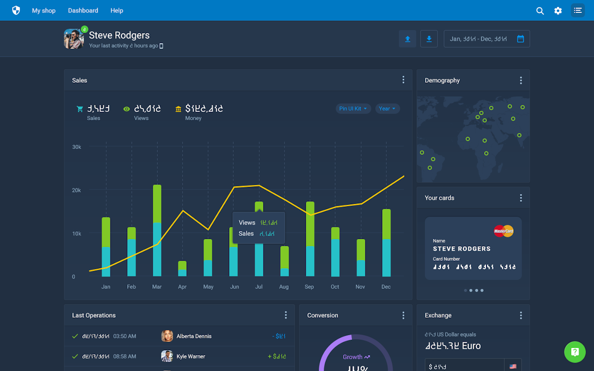
Example of the visualization mockup that inspired Norum Ipnum.


This is an example of how it might be used in a mockup:

Here’s how it all came together. In the IDEO Chicago studio, Chris and another data scientist, Joe Gambino, set up a foamcore board to capture ideas from the studio on Post-its.
They asked for people to add a fake digit idea to the board as they passed by. We got a lot of ideas to work from, but one idea stood out as an interesting exploration.
What if we used the tried and true seven-segment display as inspiration for what these numbers could look like? You might be familiar with this type of display from a digital watch or a microwave. The reason these displays are used in electronics is because they can communicate all ten numerals by “lighting up” patterns of the seven simple lines they contain.
Using the seven-segment display as inspiration, Joe then wrote a Python script to draw out all of the different non-numeral permutations of what a seven-segment display could show. We then took that print-out and starred the different characters that looked different enough from letters and numbers to have a working set of ten numerals.
This was a great start to narrowing down a set of digits. Using this set of digits, we continued the process using the brief: If these digits were the abstracted form of an original numeral, what did those numerals look like?
After this initial exploration, it seemed like there was something here we could work with. At this point, Ben suggested we do a range of weights and typefaces of these numerals to help aid in layouts, and offered to work on a serif version. Ben recommended the fantastic tool, Glyphs, that we used to build these font families, and after a few revisions, we ended up with the collection presented here.
There are two font families in the set: sans and segment (with serif to hopefully come in the future). For sans, these have six different weights and italics. They are also selectable between tabular and proportional lining.
We hope these fonts are fun to play with and useful for your mockups. Please let us know if you find an interesting use for them! The families are Open Font licensed under the SIL-OFL, and we have provided the Glyph App source files, so feel free to make your own variants and add to the collection. The Github repository can be found here.
We hope you find some fun uses for it!