◀︎ BLOG
Letting Go of Ego Helped This Designer Create a Transformational Brand


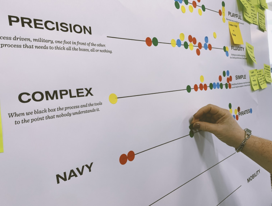
We observed employees as they worked to get a sense of how much the brand would need to flex in order to be comfortable for them to use.
I’m in a drafty room in Farringdon, London, shaking the hands of a dozen mechanical engineers. A few months before, I was scoring paper at an airy luxury atelier in Paris.
On its face, those client experiences might sound worlds apart. And they were, but not for the reason you might expect.
I came to IDEO from those luxury ateliers and joined a team that was designing a new brand for Ford Motor Company. I brought with me the best of what I learned in Paris: a vigilance about being a brand-guideline guardian and a proficiency in creating highly aspirational brands.
Our remit was to come up with a brand for the innovation lab of the 118-year-old automotive company—what would come to be D-Ford. The lab’s remit was to use human-centered design to drive progress, so the brand had to give new meaning to the word “design,” which was very specifically associated with car design internally. It also had to be capable of being comfortably and regularly used by everyone, designers and non-designers alike.
We landed on a brand that involved no special fonts and a few shapes that quite literally anyone could draw. It may not sound lofty, but it was incredibly challenging. And more than that, it was impactful—on the client and on me.
In the luxury ateliers, I was accustomed to interacting with and designing for designers, not the wider organization. I operated in a space where brand books specs were jealously guarded and consistency was the goal.
With D-Ford, the goal was to maximize brand adoption, which was ultimately about adopting the purpose of the lab. To do that, we had to educate ourselves about the organization.
What unfolded was a co-design approach. Our team traveled to different parts of the company and spoke to people, even people who felt they were very far from design. That was such a different approach and scope for me, but it surfaced an important reality: design, historically, was seen as a practice for the few at Ford, where the number of engineers outweigh that of car designers.
With D-Ford, we needed everyone to feel capable of being a designer. Our team had to set up design tools that aligned with the typical employee’s skillset, meaning the brand system had to work seamlessly with Google Slides and PowerPoint.
We sat at people’s desks to see how they built presentations, which fonts they had installed on their laptops, and what they knew about Adobe. We realized we had to design soft guardrails—no software to learn, no new typefaces to install—so that whatever they produced in the lab could be easily shared across the wider organization.
The brand needed to stick, be easy to replicate, and take into account what we found to be pretty consistent opinions about specific colors and shapes across the company. For instance, every engineer wanted us to steer clear of red because of its association with danger.

The shapes we landed on were simple. The process of getting to them was not.
We settled on three simple geometric shapes that linked to D-Ford’s three-word purpose statement and were ones that anyone could draw. A triangle for drive, a circle for human, and a plus sign for progress. They were graphic assets everyone could recreate regardless of their design proficiency, and they provided a simple but effective visual link to the story of what D-Ford stood for.
As for typeface, we ultimately chose the same one Ford was already using, meaning there was familiarity there, but we employed a different typesetting to create a completely fresh result.
The goal here was a grassroots ownership of the assets. When the 12-week project ended, our engagement with D-Ford continued [IDEO has had a nearly 20-year relationship with the carmaker], so I got to watch how the brand design was adopted and evolved and the life it took on in the hands of non-traditional designers.


One way we saw the brand put to use: An engineer created this logo for International Women’s Day using the circle, triangle, and plus sign.
For instance, there was one lab team member who had never designed anything for print before. He used the simple templates that had been created to design a booklet for a presentation he was giving. His enthusiasm and confidence in sharing his creative work with another engineering division was the type of behavior we had hoped the internal brand would foster.
Brand design is often mistaken with art. It has an artistic component but needs to be democratic. We didn’t want to create the brand as an art piece to look at but as an open book to use. The only way to make that happen was to be very empathetic. We needed empathy to understand the employees’ worries, challenges, and motivators within their existing culture, but even more than that, we had to understand what was needed to promote a different behavior—a culture of experimentation.

The end goal was to create a living and breathing brand that was rooted in what we heard its users needed—and what they didn’t want.
The aesthetics of design are important. It’s what gives us as designers the sensitivity to what works and what doesn’t visually. But the aesthetic is only as good as what people can do with it.
What attracted me to design in the first place was that I was going to push materials to the edge to design something that would be compelling. That was certainly true with luxury, where I regularly tested how far I could push tangible things. How much can I bend this plastic without it cracking? At D-Ford, I needed to bend people and their behaviors, and it was much less tangible.
The D-Ford work helped me understand the value of that different kind of design work and really demonstrated how impactful your work can be even if it feels at first like it’s going to be more gray.
Giving up the reins and not having tight control of the usage of the brand—it’s a challenge to the ego. But that’s part of what it means to design a brand that is owned by the people. If you distribute ownership you distribute ego.
That made for a humbling experience. It helped me realize how complex an organization can be and that brand does not have to get in the way of it. If anything it needs to simplify. If I had listened to that ego the end result may have been loftier and better for my personal portfolio. But the work would not have had the impact the organization needed. In the end, the right impact is what every designer strives for.